When you are viewing values by month the trend will be broken by part month values. This can be addressed by implementing a run rate calculation in your chart. This post shows you how.
Background To The Solution

Run rates are something that I have implemented in a number of projects. When the question of how to create one was asked in Qlik Community thread, by Linoy Elias, I offered up a solution. It also occurred to me that it would be a useful topic for a general visualisation discussion, this prompted a posting on LinkedIn. For a complete discussion around run rates and projections please take a read of this posting.https://www.linkedin.com/pulse/improving-your-run-rate-steve-dark
What follows is instructions on how to implement this in Qlik Sense or QlikView, taken from the Community post, and links to working examples.
Implementing The Solution
This example assumes that you have a numeric field called Value, and a date field called Date and a field with the month in called MonthYear. You will need to change the expressions and variables to match your fields.
First, try getting the current month added twice at the end, to test Set Analysis. To do this, set up a variable with the max MonthYear, call it vMaxMonthYear;
=Max(MonthYear)This expression will then prove that the max MonthYear value is working, by doubling the final month.
sum(Value) + sum({<MonthYear={'$(vMaxMonthYear)'}>}Value)Check that works before moving on; you may need to put a Date function around the Max(MonthYear) to convert it to the correct format to match the month year.
Once you have that, you can set about turning the value you are adding on in the last month into a run rate – based on the number of days left in the month.
You will want two more variables, vDaysInMaxMonth and vMaxDayInMaxMonth these will need to contain the code:
=Day(MonthEnd(vMaxMonthYear))and
=Day(max({<MonthYear={'$(vMaxMonthYear)'}>}Date))Test that these variables have the correct values by putting them into text boxes or input boxes before proceeding.
Once you have the correct days you will want to work out the factor you need for your run rate from those values, set up a new variable vRunRateFactor for this:
=(vDaysInMaxMonth - vMaxDayInMaxMonth) / vMaxDayInMaxMonthThis variable will return a factor that the value for the part of the month needs to be multiplied by to give you the rest of the month. If you are exactly half way through the month the value will be 1, earlier it will be higher and later in the month it will be lower.
You can then apply this factor back to your original expression:
sum(Value) + (sum({<MonthYear={'$(vMaxMonthYear)'}>}Value) * vRunRateFactor)If you have a bar chart, rather than a line chart, you can add the extra run rate on as a stacked bar (a separate expression) rather than adding on to the main expression. This makes it clear that you have a run rate in play – but you then lose the ability not to have an axis that doesn’t start at zero. With line charts you can either just have a single line (with the run rate) or a line that deviates.
Here are charts showing a line without run rate, and various options for showing a run rate:
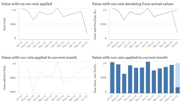
You should make sure that somewhere on the chart that it is clear that the final month has a run rate added, perhaps by adding text in chart, or the caption.
Download The Examples
As with many of the other examples and helpful apps I have put together are downloadable from Qlik Community you can download apps showing run rates for both Qlik Sense and QlikView.
The links are as follows:


Simple idea, yet very effective
Thanks
Thanks, John.
nice illustration. Good for education and improving Qlik expertize.