Here is the second extract from our Sense Training Course material. These are chapters picked from the training manual as they stand alone and we think they are generally useful.
A twelve page sample PDF of the material is available here.
I will be delivering this course in Bracknell next month. There are still a couple of places left, so if you want to book a place please be quick.
6.1 Introducing Qlik Sense Visualisations
There are many different ways of visualising data in Sense. You have used some of these already and this chapter looks through all the other types of object that come included in Sense. There are many other visualisations available, through Extensions, which are third-party components written in JavaScript. Many of these Extensions are free to download and use, others require a licence to be purchased, we will look at extensions in a later chapter.
All the objects included in Sense as standard are, perhaps a little confusingly, to be found under the Charts button. You will note that on the list of objects here you will also find Tables, Text and Image objects and KPIs. You may come across all of these referred to as Charts, due to the menu heading in Sense. Personally though, I prefer Object as a generic term for these items, or Visualisation, as all objects are used to display data in one way or another.

Personally, I always start with the question “why not a bar chart?” and go from there. If you have a sheet full of bar charts (like our Date and Cleaning sheets), don’t go changing some of them to pie charts just to break up the look of the page – it may be that you already have the best way of showing your data right there.
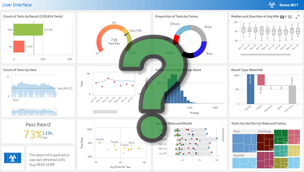
If you are considering a page full of speed-dial gauges and doughnut charts, then you are probably giving more thought to creating a shiny dashboard than conveying the meaning in your numbers. Stop! The appeal of shiny dashboards will diminish, but the importance of the numbers will not.
If you would like to receive future sample sections from our training material please subscribe to the blog using the form at the top of this page.


Leave A Comment