One of our most popular Qlik Downloads is the Data Profiler we produced for use with QlikView. This post shows how you can produce a Qlik Sense Data Profiler using the same techniques.
The QlikView Data Profiler
Back in 2013, I put out a blog post about the Data Profiler that we created and use in house for getting a flavour for the data values that exist in a new set of data. We always use this in the initial stages of building a solution, and it generally ended up on a tab at the back of finished QlikView applications. As I’m sure you can imagine we have now ported this across to Qlik Sense to use in applications there.
This blog post covers how you can build the same thing in Sense, but it skips over some of the technical details of the expressions. If you want to get under the bonnet of this solution, you may want to read the previous post, here:
https://www.quickintelligence.co.uk/qlikview-data-profiler/
Bringing To A New Environment

=[$(=minstring($Field))]If you are using the September 2017 release or above, you can also add the =minstring($Field) in the Label field. This will change column labels and dimensions to be the current selected value. If you, like me, have been waiting over two years for this it’s quite a relief to be able to do this.
The next step is to start creating the objects on the page, starting with a list of fields. Drag a new Filter Pane onto the page (or double click Filter Pane). You can not select the dimension you require from the Dimension button, or find it on the Field List on the left hand side – as it is a hidden system field.
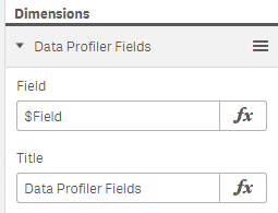
You need to open the Data option on the Filter Pane properties and set the Field to $Field, the Title should be set to Data Profiler Fields.

The filter box for tables is built in the same way, with values being set to $Table and Data Profiler Tables respectively.

The next list box flexes to show the values in the Master Dimension we created earlier. You can add this to the page just by double clicking the Master Dimension Data Profiler Dimension from the left hand panel. If you are in the July 2017 release or above you can then change the title to also be =minstring($Field).

And now we get to putting in the bar chart which shows us how many times each value appears in the data model. Double click the bar chart icon to add this to the page. The dimension is again our Master Dimension Data Profiler Dimension. And the measure for the chart requires the following:
count([$(=minstring($Field))])You can then tidy the chart up by changing the name of the Measure to Occurrences, setting the title for the chart to =’Occurrences of Values in $(=minstring($Field))’ and rotating the chart to have horizontal bars (under Appearance and Presentation), changing the sort order to descending by Measure (do this by dragging Occurrences above the Dimension under Sort) and removing the axis labels (under Appearance and X-Axis & Y-Axis).
The chart should then end up looking a bit like this:

The final object is a table that gives some stats about the field that has been chosen. This table has a number of measures, all of which use the [$(=minstring($Field))] field-name in the expression. The complete list of expressions I use for this are here.
| Measure | Expression |
|---|---|
| Field Name | =minstring($Field) |
| Min Value | minstring( [$(=minstring($Field))]) |
| Max Value | maxstring( [$(=minstring($Field))]) |
| Max Length | max(len([$(=minstring($Field))])) |
| Min Length | min(len([$(=minstring($Field))])) |
| Has Alpha | if(max(len(keepchar(lower([$(=minstring($Field))]), ‘abcdefghijklmnopqrstuvwxyz’))) > 0, ‘Yes’, ‘No’) |
| Has Number | if(max(len(keepchar(lower([$(=minstring($Field))]), ‘0123456789’))) > 0, ‘Yes’, ‘No’) |
| Has Non Alhpa Num | if(max(len(purgechar(lower([$(=minstring($Field))]), ‘0123456789abcdefghijklmnopqrstuvwxyz’))) > 0, ‘Yes’, ‘No’) |
| Distinct Values | num(count(DISTINCT [$(=minstring($Field))]), ‘#,##0’) & ‘ of ‘ & num(count([$(=minstring($Field))]), ‘#,##0’) & ‘ (‘ & num(count(DISTINCT [$(=minstring($Field))]) / count([$(=minstring($Field))]), ‘#,##0.0%’) & ‘ unique)’ |
| Null Values | sum(if(isnull( [$(=minstring($Field))]), 1, 0)) |
| Blank Values | sum(if(trim([$(=minstring($Field))]) = ”, 1, 0)) |
Once this has been done you will want to arrange the objects that you have created into a sensible formation, and you should have a page that looks a bit like this:

Now you can pick any table and field combo from your data set and see some basic information about that table and field. For those who have come from QlikView (or even if you haven’t) you will need to remember that the default action on clicking a value in a filter pane is to add to the selection. This is not what you will want to do with these filter panes. To get the QlikView style functionality of a click clearing the current selection just hold down Ctrl when you click.
Copy and Paste Objects
One of the beauties of the QlikView implementation of this profiler was that you could go to the profiler page in one app, do a quick Ctrl+A then Ctrl+C to copy all objects, then simply Ctrl+V into a new app. It’s not quite as simple in Sense. You will need to create the Master Dimension in each app that you use the profiler, and each object needs to be copied one at a time. Copying and pasting is not possible between different versions of Sense (Desktop, Cloud and Enterprrise) but you can always Import a QVF file from one environment to another to allow that copy to work.
If you would like to download a QVF file with the objects and code in, this can be downloaded from Qlik Community here:
https://community.qlik.com/t5/Qlik-Sense-Documents/Qlik-Sense-App-Generic-Data-Profiler/ta-p/1490501
You will also find it on our list of downloadable Qlik examples (along with many other apps).
With the previous version of the app, there was quite a lot of discussion on both the blog post and the Qlik Community regarding how it could be improved and how it works. You may want to check those places out also, or start a new conversation below.


Hi Steve,
thanks for an excellent post. I think there’s a small glitch in your measures here in the blog post. [Has Non Alhpa Num] and [Has Number] are the same and I guess they should do different things.
Juraj
Thanks for spotting this Juraj. As there is no sensible export function in Sense for expressions this was done with old fashioned copy and paste, I obviously copied once and pasted twice there. This has now been corrected.
Thank you very much
I have been using this your development in GlikViev for several years. Very easy to reconcile and debug the data model
Thank you Alexander – pleased to hear you have been finding the QV version useful, hope the Sense one proves as useful in future.
[…] подобный документ и для Qlik Sense. Сегодня расскажу о Qlik Sense Data Profiler – как и предыдущая версия, он представляет собой […]
thanks tho shre this informative blog.
[…] qlikview recientemente ha creado la versión QlikSense que también esta disponible en su página qlikintelligence.co.uk. Aquí la cosa se complica, como bien indica el autor del profiler en Sense no se pueden copiar […]
hi, iv been using some version of the Data Profiler in qlikview for long time and it proved helpful many time so thanks.
while reading this post and trying to implement it i stumbled (after some trial and error lol)
upon an interesting addition.
iv seen how you made a filter pane to show dynamically the values of the field that is select in the $Field.
in qlikview when you have one value selected and you qlik on another (gray) value it replaces the selection,
in sense it adds it until your press the green V mark on top. but since your filter is using “minstring” it allways shows the lowest (alphabetically) field name from the $field.
so it made me wonder how can i access the second value,or the 3rd,
and then i thought if i can pull it off i might be able tp have a table pre-made with like say 10-15 of the values selected in the $Field and i can sort of make a dynamic table to show values of the fields i selected in the $Field dimension.
(lol hope i made myself clear:))
anyway what i came up with was a table object with (EG 10) dimensions.
in the first dimension i put this expression:
=[$(=aggr( if(rank($Field)=GetPossibleCount($Field),$Field) ,$Field))]
and in its label i put this expression:
=aggr( if(rank($Field)=GetPossibleCount($Field),$Field) ,$Field)
in the 2nd dimension i put this expression:
=[$(=aggr( if(rank($Field)=GetPossibleCount($Field)-1,$Field) ,$Field))]
and in its lable i put this exprerssion:
=aggr( if(rank($Field)=GetPossibleCount($Field)-1,$Field) ,$Field)
and so on ( you can prepare as many as you like)
and now i can very fast show values of fields i select from the filter-pane with the $Field dimension.
it helps since in sense if you want to show many field in a table you have to manual add each field (which is terrible lol)
hope i didn’t ramble too much.
please feel free to make any changes if you think it will make what i said more clear:)
Yours
Daniel Chotzen
Hi Daniel. Thank you for your notes. You are correct about the addition of fields in Sense being a bit of a pain. There is a bit of a workaround, whcih I am planning to put on the blog soon – it is also better in April 2018 if you upgrade to this. Regarding replacing fields with a click, rather than adding to the list, simply hold Ctrl as you click – this is exactly the opposite to the functionality in QlikView. Regarding the table which allows multiple colums, this looks like a good solution. You do need to be careful that you only adopt the approach in apps where there are not data islands or fields with masssive numbers of unique values – this could allow a table to be created which causes real problems for the server.
Thanks again for sharing.